DgsCreateRadioButton
From Multi Theft Auto: Wiki
This function creates a radio button.
Syntax
element dgsCreateRadioButton ( float x, float y, float width, float height, string text, bool relative [, element parent = nil, int textcolor, float textScaleX = 1.0, float textScaleY = 1.0, element defimg_f = nil, element hovimg_f = nil, element cliimg_f = nil, int defcolor_f = 0xFFFFFFFF, int hovcolor_f = 0xFFFFFFFF, int clicolor_f = 0xFFB4B4B4, element defimg_t = nil, element hovimg_t = nil, element cliimg_t = nil, int defcolor_t = 0xFFFFFFFF, int hovcolor_t = 0xFFFFFFFF,int clicolor_t = 0xFFB4B4B4 ] )
Required Arguments
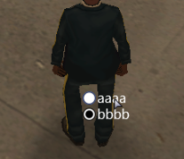
Example Dx radio buttons.
- x: A float of the 2D x position of the radio button on a player's screen. This is affected by the relative argument.
- y: A float of the 2D y position of the radio button on a player's screen. This is affected by the relative argument.
- width: A float of the width of the text field next to the radio button. This is affected by the relative argument.
- height: A float of the height of the text field next to the radio button. This is affected by the relative argument.
- text: The text to be displayed next to the radio button.
- relative: This is whether sizes and positioning are relative. If this is true, then all x,y,width,height floats must be between 0 and 1, representing measures relative to the parent.
Optional Arguments
NOTE: When using optional arguments, you might need to supply all arguments before the one you wish to use. For more information on optional arguments, see optional arguments.
- parent: This is the parent that the DGS radio button is attached to. If the relative argument is true, sizes and positioning will be made relative to this parent. If the relative argument is false, positioning will be the number of offset pixels from the parent's origin. If no parent is passed, the parent will become the screen - causing positioning and sizing according to screen positioning.
- textcolor: An int of the color of the radio button.
- textScaleX : A float of the width of the text scale.
- textScaleY: A float of the height of the text scale.
- defimg_f: An image element of the default state of the radio button. (unselected)
- hovimg_f: An image element of the hovered state of the radio button. (unselected)
- cliimg_f: An image element of the clicked state of the radio button. (unselected)
- defcolor_f: An integer of the color of the default state of the radio button. (unselected)
- hovcolor_f: An integer of the color of the hovered state of the radio button. (unselected)
- clicolor_f: An integer of the color of the clicked state of the radio button. (unselected)
- defimg_t: An image element of the default state of the radio button. (selected)
- hovimg_t: An image element of the hovered state of the radio button. (selected)
- cliimg_t: An image element of the clicked state of the radio button. (selected)
- defcolor_t: An integer of the color of the default state of the radio button. (selected)
- hovcolor_t: An integer of the color of the hovered state of the radio button. (selected)
- clicolor_t: An integer of the color of the clicked state of the radio button. (selected)
Example
Click to collapse [-]
ClientExample 1:
DGS = exports.dgs
showCursor(true)
local rb1= DGS:dgsCreateRadioButton(500,500,200,30,"aaaa",false)
local rb2 = DGS:dgsCreateRadioButton(500,520,200,30,"bbbb",false)
See Also
- dgsGetPosition
- dgsSetPosition
- dgsSetParent
- dgsGetParent
- dgsGetChild
- dgsGetChildren
- dgsGetSize
- dgsSetSize
- dgsGetType
- dgsSetLayer
- dgsGetLayer
- dgsSetCurrentLayerIndex
- dgsGetCurrentLayerIndex
- dgsGetLayerElements
- dgsGetProperty
- dgsSetProperty
- dgsSetPropertyInherit
- dgsGetProperties
- dgsSetProperties
- dgsGetVisible
- dgsSetVisible
- dgsGetEnabled
- dgsSetEnabled
- dgsGetSide
- dgsSetSide
- dgsGetAlpha
- dgsSetAlpha
- dgsGetFont
- dgsSetFont
- dgsGetText
- dgsSetText
- dgsGetPostGUI
- dgsSetPostGUI
- dgsGetInputEnabled
- dgsSetInputEnabled
- dgsGetInputMode
- dgsSetInputMode
- dgsFocus
- dgsBlur
- dgsCreateFont
- dgsBringToFront
- dgsMoveToBack
- dgsGetScreenSize
- dgsGetCursorPosition
- dgsGetMouseEnterGUI
- dgsGetMouseLeaveGUI
- dgsSetSystemFont
- dgsGetSystemFont
- dgsGetDxGUINoParent
- dgsGetDxGUIFromResource
- dgsGetFocusedGUI
- dgsGetExportedFunctionName
- dgsImportFunction
- dgsImportOOPClass
- dgsG2DLoadHooker
- dgsSetRenderSetting
- dgsGetRenderSetting
- dgsSimulateClick
- dgsGetRootElement
- dgsAddMoveHandler
- dgsRemoveMoveHandler
- dgsIsMoveHandled
- dgsAddSizeHandler
- dgsRemoveSizeHandler
- dgsIsSizeHandled
- dgsAttachElemetns
- dgsDetachElements
- dgsElementIsAttached
- dgsSetDoubleClickInterval
- dgsGetDoubleClickInterval
Multi Language Supports
- dgsTranslationTableExists
- dgsSetTranslationTable
- dgsAttachToTranslation
- dgsDetachFromTranslation
- dgsSetAttachTranslation
- dgsGetTranslationName
Animation
- dgsAnimTo
- dgsIsAniming
- dgsStopAniming
- dgsMoveTo
- dgsIsMoving
- dgsStopMoving
- dgsSizeTo
- dgsIsSizing
- dgsStopSizing
- dgsAlphaTo
- dgsIsAlphaing
- dgsStopAlphaing
- dgsAddEasingFunction
- dgsRemoveEasingFunction
- dgsEasingFunctionExists
3D Interface
- dgsCreate3DInterface
- dgs3DInterfaceGetBlendMode
- dgs3DInterfaceSetBlendMode
- dgs3DInterfaceGetPosition
- dgs3DInterfaceSetPosition
- dgs3DInterfaceGetSize
- dgs3DInterfaceSetSize
- dgs3DInterfaceGetResolution
- dgs3DInterfaceSetResolution
- dgs3DInterfaceAttachToElement
- dgs3DInterfaceIsAttached
- dgs3DInterfaceDetachFromElement
- dgs3DInterfaceSetAttachedOffsets
- dgs3DInterfaceGetAttachedOffsets
- dgs3DInterfaceSetRotation
- dgs3DInterfaceGetRotation
3D Text
- dgsCreate3DText
- dgs3DTextGetDimension
- dgs3DTextSetDimension
- dgs3DTextGetInterior
- dgs3DTextSetInterior
- dgs3DTextAttachToElement
- dgs3DTextIsAttached
- dgs3DTextDetachFromElement
- dgs3DTextSetAttachedOffsets
- dgs3DTextGetAttachedOffsets
Arrow List
- dgsCreateArrowList
- dgsArrowListAddItem
- dgsArrowListRemoveItem
- dgsArrowListSetItemText
- dgsArrowListGetItemText
- dgsArrowListSetItemValue
- dgsArrowListGetItemValue
- dgsArrowListSetItemRange
- dgsArrowListGetItemRange
- dgsArrowListSetItemTranslationTable
- dgsArrowListGetItemTranslationTable
- dgsArrowListSetItemStep
- dgsArrowListGetItemStep
- dgsArrowListGetItemTranslatedValue
- dgsArrowListClear
Browser
Button
Check Box
- dgsCreateCheckBox
- dgsCheckBoxGetSelected
- dgsCheckBoxSetSelected
- dgsCheckBoxSetHorizontalAlign
- dgsCheckBoxGetHorizontalAlign
- dgsCheckBoxSetVerticalAlign
- dgsCheckBoxGetVerticalAlign
Combo Box
- dgsCreateComboBox
- dgsComboBoxAddItem
- dgsComboBoxRemoveItem
- dgsComboBoxSetItemText
- dgsComboBoxGetItemText
- dgsComboBoxGetItemCount
- dgsComboBoxClear
- dgsComboBoxSetSelectedItem
- dgsComboBoxGetSelectedItem
- dgsComboBoxSetItemColor
- dgsComboBoxGetItemColor
- dgsComboBoxGetState
- dgsComboBoxSetState
- dgsComboBoxGetBoxHeight
- dgsComboBoxSetBoxHeight
- dgsComboBoxGetScrollBar
- dgsComboBoxSetScrollPosition
- dgsComboBoxGetScrollPosition
- dgsComboBoxSetCaptionText
- dgsComboBoxGetCaptionText
Edit
- dgsCreateEdit
- dgsEditMoveCaret
- dgsEditGetCaretPosition
- dgsEditSetCaretPosition
- dgsEditSetCaretStyle
- dgsEditGetCaretStyle
- dgsEditSetWhiteList
- dgsEditGetMaxLength
- dgsEditSetMaxLength
- dgsEditSetReadOnly
- dgsEditGetReadOnly
- dgsEditSetMasked
- dgsEditGetMasked
- dgsEditSetUnderlined
- dgsEditGetUnderlined
- dgsEditSetHorizontalAlign
- dgsEditSetVerticalAlign
- dgsEditGetHorizontalAlign
- dgsEditGetVerticalAlign
- dgsEditSetAlignment
- dgsEditGetAlignment
- dgsEditInsertText
- dgsEditDeleteText
- dgsEditGetPartOfText
- dgsEditClearText
- dgsEditReplaceText
- dgsEditSetTypingSound
- dgsEditGetTypingSound
- dgsEditSetPlaceHolder
- dgsEditGetPlaceHolder
- dgsEditAddAutoComplete
- dgsEditRemoveAutoComplete
- dgsEditSetAutoComplete
- dgsEditGetAutoComplete
Ellipse Detect Area
Detect Area
Grid List
- dgsCreateGridList
- dgsGridListGetScrollBar
- dgsGridListSetScrollPosition
- dgsGridListGetScrollPosition
- dgsGridListSetHorizontalScrollPosition
- dgsGridListGetHorizontalScrollPosition
- dgsGridListSetVerticalScrollPosition
- dgsGridListGetVerticalScrollPosition
- dgsGridListResetScrollBarPosition
- dgsGridListSetColumnRelative
- dgsGridListGetColumnRelative
- dgsGridListAddColumn
- dgsGridListGetColumnCount
- dgsGridListRemoveColumn
- dgsGridListGetColumnAllWidth
- dgsGridListGetColumnHeight
- dgsGridListSetColumnHeight
- dgsGridListGetColumnWidth
- dgsGridListSetColumnWidth
- dgsGridListAutoSizeColumn
- dgsGridListGetColumnTitle
- dgsGridListSetColumnTitle
- dgsGridListGetColumnFont
- dgsGridListSetColumnFont
- dgsGridListAddRow
- dgsGridListRemoveRow
- dgsGridListClearRow
- dgsGridListClearColumn
- dgsGridListClear
- dgsGridListGetRowCount
- dgsGridListSetItemText
- dgsGridListGetItemText
- dgsGridListGetSelectedItem
- dgsGridListSetSelectedItem
- dgsGridListSetItemColor
- dgsGridListGetItemColor
- dgsGridListSetItemData
- dgsGridListGetItemData
- dgsGridListSetItemImage
- dgsGridListGetItemImage
- dgsGridListRemoveItemImage
- dgsGridListGetRowBackGroundImage
- dgsGridListSetRowBackGroundImage
- dgsGridListSetRowBackGroundColor
- dgsGridListGetRowBackGroundColor
- dgsGridListSetRowAsSection
- dgsGridListSelectItem
- dgsGridListItemIsSelected
- dgsGridListSetMultiSelectionEnabled
- dgsGridListGetMultiSelectionEnabled
- dgsGridListSetSelectionMode
- dgsGridListGetSelectionMode
- dgsGridListGetSelectedCount
- dgsGridListGetSelectedItems
- dgsGridListSetSelectedItems
- dgsGridListSetSortFunction
- dgsGridListSetAutoSortEnabled
- dgsGridListGetAutoSortEnabled
- dgsGridListSetSortEnabled
- dgsGridListGetSortEnabled
- dgsGridListSetSortColumn
- dgsGridListGetSortColumn
- dgsGridListGetEnterColumn
- dgsGridListSort
- dgsGridListSetNavigationEnabled
- dgsGridListGetNavigationEnabled
Image
- dgsCreateImage
- dgsImageSetImage
- dgsImageGetImage
- dgsImageSetUVSize
- dgsImageGetUVSize
- dgsImageSetUVPosition
- dgsImageGetUVPosition
Memo
- dgsCreateMemo
- dgsMemoMoveCaret
- dgsMemoSeekPosition
- dgsMemoGetScrollBar
- dgsMemoSetScrollPosition
- dgsMemoGetScrollPosition
- dgsMemoSetHorizontalScrollPosition
- dgsMemoGetHorizontalScrollPosition
- dgsMemoSetVerticalScrollPosition
- dgsMemoGetVerticalScrollPosition
- dgsMemoSetCaretPosition
- dgsMemoGetCaretPosition
- dgsMemoSetCaretStyle
- dgsMemoGetCaretStyle
- dgsMemoSetReadOnly
- dgsMemoGetReadOnly
- dgsMemoGetPartOfText
- dgsMemoDeleteText
- dgsMemoInsertText
- dgsMemoClearText
- dgsMemoSetTypingSound
- dgsMemoGetTypingSound
- dgsMemoGetLineCount
- dgsMemoSetWordWarpState
- dgsMemoGetWordWarpState
- dgsMemoSetScrollBarState
- dgsMemoGetScrollBarState
Label
- dgsCreateLabel
- dgsLabelSetColor
- dgsLabelGetColor
- dgsLabelSetHorizontalAlign
- dgsLabelGetHorizontalAlign
- dgsLabelSetVerticalAlign
- dgsLabelGetVerticalAlign
- dgsLabelGetTextExtent
- dgsLabelGetFontHeight
Progress Bar
- dgsCreateProgressBar
- dgsProgressBarGetProgress
- dgsProgressBarSetProgress
- dgsProgressBarGetMode
- dgsProgressBarSetMode
- dgsProgressBarGetStyle
- dgsProgressBarSetStyle
- dgsProgressBarGetStyleProperty
- dgsProgressBarGetStyleProperties
- dgsProgressBarSetStyleProperty
Radio Button
- dgsCreateRadioButton
- dgsRadioButtonGetSelected
- dgsRadioButtonSetSelected
- dgsRadioButtonSetHorizontalAlign
- dgsRadioButtonGetHorizontalAlign
- dgsRadioButtonSetVerticalAlign
- dgsRadioButtonGetVerticalAlign
Scroll Bar
- dgsCreateScrollBar
- dgsScrollBarSetScrollPosition
- dgsScrollBarGetScrollPosition
- dgsScrollBarSetCursorLength
- dgsScrollBarGetCursorLength
- dgsScrollBarSetGrades
- dgsScrollBarGetGrades
- dgsScrollBarSetLocked
- dgsScrollBarGetLocked
Scroll Pane
- dgsCreateScrollPane
- dgsScrollPaneGetScrollBar
- dgsScrollPaneSetScrollPosition
- dgsScrollPaneGetScrollPosition
- dgsScrollPaneSetHorizontalScrollPosition
- dgsScrollPaneGetHorizontalScrollPosition
- dgsScrollPaneSetVerticalScrollPosition
- dgsScrollPaneGetVerticalScrollPosition
- dgsScrollPaneSetScrollBarState
- dgsScrollPaneGetScrollBarState
Switch Button
- dgsCreateSwitchButton
- dgsSwitchButtonGetState
- dgsSwitchButtonSetState
- dgsSwitchButtonSetText
- dgsSwitchButtonGetText
Tab Panel
- dgsCreateTabPanel
- dgsCreateTab
- dgsGetSelectedTab
- dgsSetSelectedTab
- dgsTabPanelGetTabFromID
- dgsTabPanelMoveTab
- dgsTabPanelGetTabID
- dgsDeleteTab
Window
- dgsCreateWindow
- dgsWindowSetSizable
- dgsWindowSetMovable
- dgsWindowGetSizable
- dgsWindowGetMovable
- dgsCloseWindow
- dgsWindowSetCloseButtonEnabled
- dgsWindowGetCloseButtonEnabled
- dgsWindowSetCloseButtonSize
- dgsWindowGetCloseButtonSize
- dgsWindowGetCloseButton
Plugin
Media Browser
- dgsCreateMediaBrowser
- dgsMediaLoadMedia
- dgsMediaGetMediaPath
- dgsMediaClearMedia
- dgsMediaIsStreamMedia
- dgsMediaPlay
- dgsMediaPause
- dgsMediaStop
- dgsMediaSetSize
- dgsMediaSetFilled
- dgsMediaGetFilled
- dgsMediaSetFullScreen
- dgsMediaGetDuration
- dgsMediaGetCurrentPosition
- dgsMediaSetCurrentPosition
- dgsMediaGetLooped
- dgsMediaSetLooped
Rounded Rectangle
- dgsCreateRoundRect
- dgsRoundRectSetTexture
- dgsRoundRectSetRadius
- dgsRoundRectGetRadius
- dgsRoundRectSetColor
- dgsRoundRectGetColor
- dgsRoundRectSetColorOverwritten
- dgsRoundRectGetColorOverwritten
Color Picker
- dgsCreateColorPicker
- dgsColorPickerSetColor
- dgsColorPickerGetColor
- dgsBindToColorPicker
- dgsUnbindFromColorPicker
- dgsColorPickerCreateComponentSelector
- dgsColorPickerGetComponentSelectorValue
- dgsColorPickerSetComponentSelectorValue